Color Theory for Digital Design: Basics and Beyond
Explore the fundamentals of color theory and learn how to apply these principles in digital design to create visually appealing and effective projects.
4 min read · May 27, 2024
Understanding color theory is fundamental for creating visually appealing and effective digital designs. Whether you're designing a website, an app, or any digital content, the right use of color can make your work stand out and resonate with your audience. This article will guide you through the basics of color theory and how to apply these principles using our suite of tools.

The Basics of Color Theory
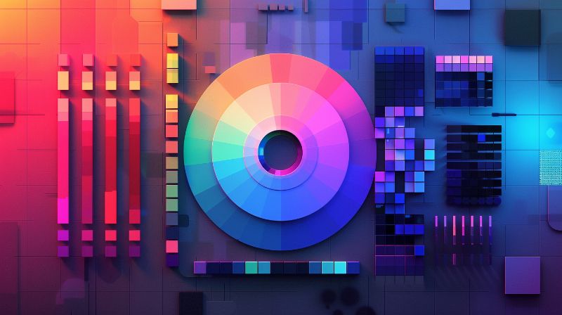
Color theory is a framework that designers use to understand how colors interact and how they can be combined to create aesthetically pleasing designs. The fundamental elements include the color wheel, color harmonies, and color contexts.
- Primary Colors: Red, blue, and yellow – these colors cannot be created by mixing other colors.
- Secondary Colors: Green, orange, and purple – these are formed by mixing primary colors.
- Tertiary Colors: Colors created by mixing primary and secondary colors, like red-orange or blue-green.

Applying Color Harmonies in Digital Design
Color harmonies are combinations of colors that are pleasing to the eye. They are used to create a balanced and harmonious design. Some popular harmonies include:
- Complementary Colors: Opposite each other on the color wheel (e.g., blue and orange). They provide high contrast and vibrant look.
- Analogous Colors: Next to each other on the wheel (e.g., blue, blue-green, and green). They create a serene and comfortable design.
- Triadic Colors: Equally spaced around the wheel (e.g., red, yellow, blue). These offer high contrast while retaining balance and richness.
Understanding Color Context and Interaction
How colors appear can change based on their context and the colors around them. Understanding this interaction is crucial for making design decisions that are both functional and visually appealing.
- Simultaneous Contrast: How two colors affect each other when placed side by side. For example, a grey color will look lighter next to black and darker next to white.
- Vibrating Colors: High-contrast color combinations that create a vibrating effect. Use these carefully to draw attention but avoid in large amounts as they can be jarring.

Tools to Help You Apply Color Theory
Using the right tools can simplify the application of color theory in your projects. Our platform offers several utilities to help you with this:
- Color Converter: Convert colors between different formats (Hex, RGB, HSL) to suit your design needs.
- Gradient Generator: Create smooth color transitions to enhance your designs.
- Color Blending Tool: Blend multiple colors to find unique and harmonious palettes.

Conclusion
Mastering color theory can elevate your digital designs, making them more appealing and effective. Whether you’re selecting a color palette or tweaking your design’s visual hierarchy, understanding these principles will guide you to better results. Explore our tools to put these principles into practice and create designs that not only look good but also resonate with your audience.
Start experimenting with colors today! Check out our Colors Converter, Gradient Generator, and Colors Blending Tool to bring your digital designs to life.